I came across a question recently about building a hierarchical infrastructure dashboard, something that lets you see:
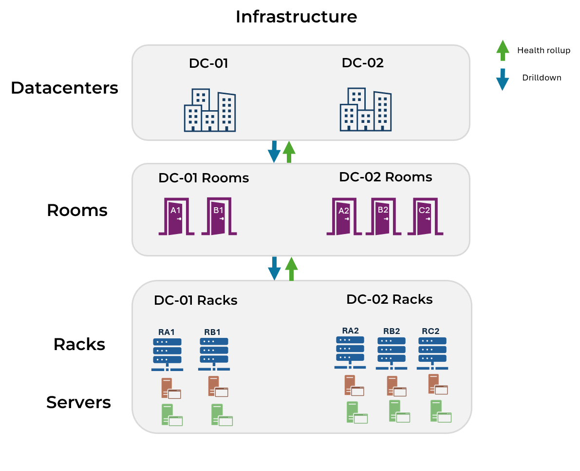
Data Center → Rooms → Racks → Servers
Here’s what they needed:
- Each level appears as a clickable box (except the lowest level which shows actual metrics)
- Clicking a box drills down to the next level’s dashboard
- If a server has a problem, that issue shows all the way up to the data center
- Health state refreshes automatically as conditions change
SquaredUp’s health roll-up makes this dead simple. Here’s how I built it.
Step 1: Start with servers in racks
I built this from the server level upward.
I began by creating a dashboard that shows server metrics for each rack. The key point is that each rack has its own dashboard, filtered to the servers that belong to it.
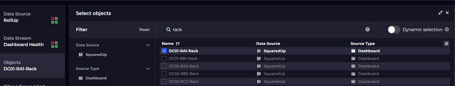
In my example, I named the dashboards after the racks they represent, such as DC01-RA1-Rack or DC02-RA2-Rack.
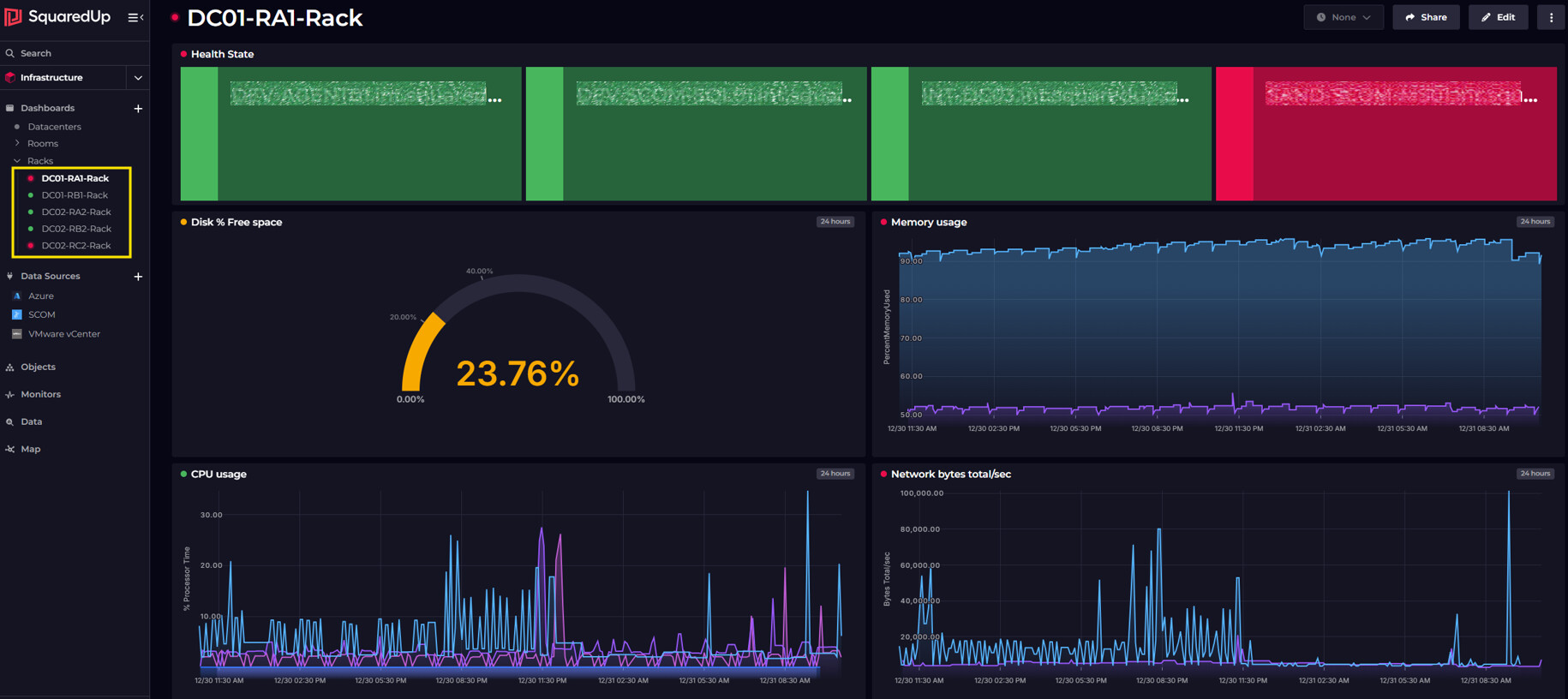
On each dashboard, I added tiles for the metrics I needed.
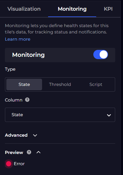
I then enabled monitoring on these tiles and set thresholds that made sense for my environment.
At this point, SquaredUp started rolling health up automatically. The dashboard reflected the worst health state of its monitored tiles, which I could see as a status indicator next to the dashboard name.
I repeated this for each rack so that every rack had a corresponding server dashboard.
Note: For large environments with dozens of racks, you might want to automate dashboard creation using SquaredUp’s Terraform provider instead of creating each one manually.
Step 2: Represent rooms using health tiles
Next, I created a dashboard to represent the racks within each room. For example, I created a dashboard called DC-01-Rooms to represent all rooms in DC-01, with separate tiles for each room.
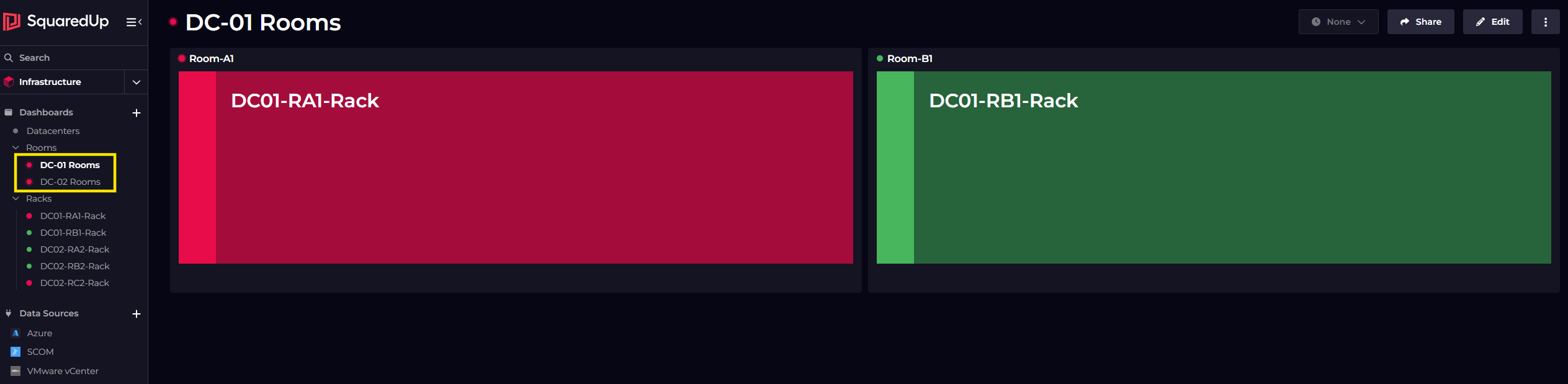
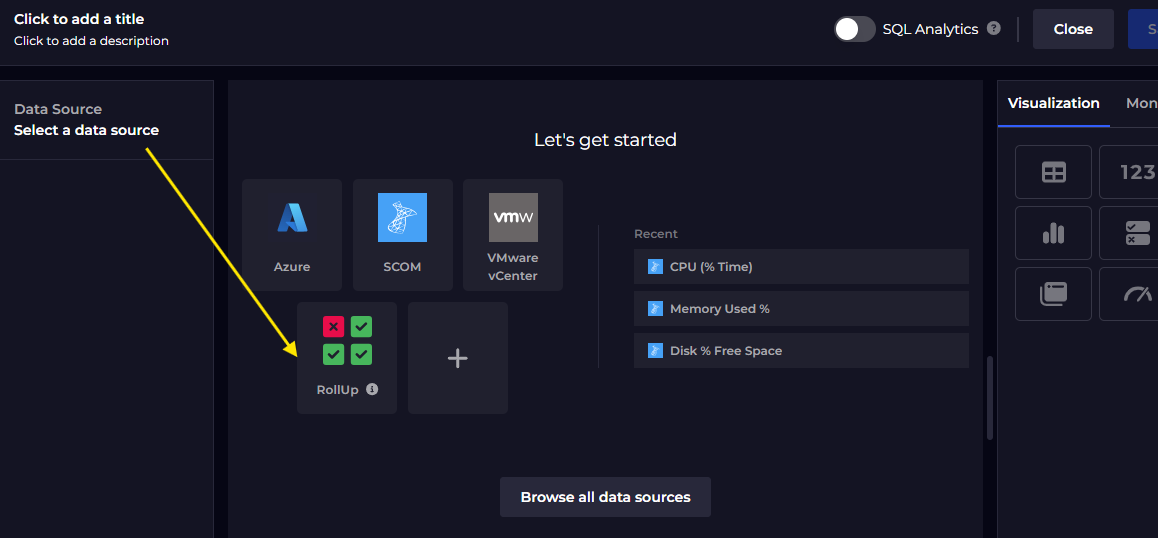
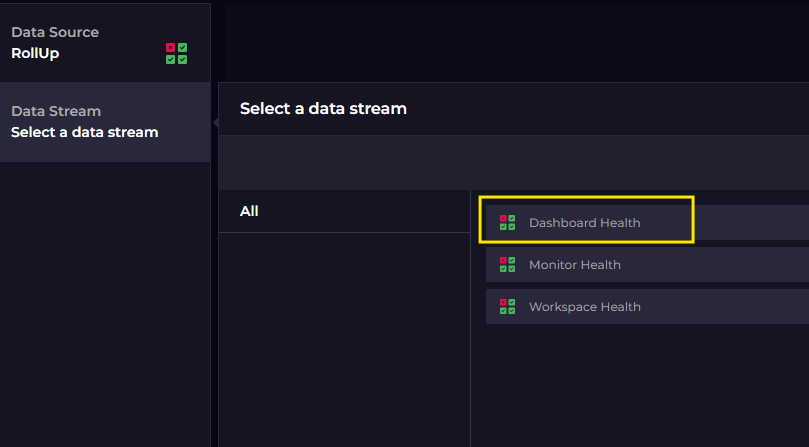
On this dashboard, I added health tile using the Rollup data source that reference the rack dashboards I created earlier. These tiles don’t display metrics, they only reflect the health of the dashboards they point to.
I enabled monitoring on the tiles using the State monitor type. This made the tile show the health status, which then rolled up to the dashboard level.
Now, if a server in any rack has a CPU, disk, or any other issue, the specific rack dashboard becomes unhealthy and the health rolls up to the room dashboard automatically.
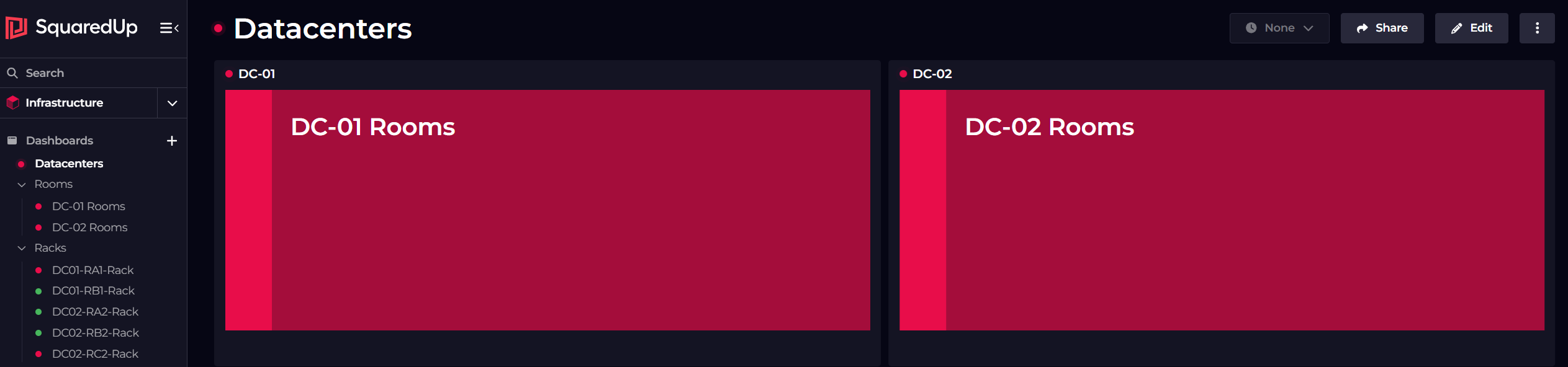
Step 3: Create the data center overview (Top level)
This dashboard contains health rollup tiles for each room within that data center. It provides a summary view where the only question being answered is whether the data center was healthy or not.
I created the tiles using the same Rollup data source approach, but this time I selected the room dashboards.
As usual, I enabled monitoring here.
From this dashboard, users can click down into rooms, then racks, and finally servers.
How the health flow works
Here’s what happens when something goes wrong:
If a server crosses any threshold, the rack dashboard becomes critical. That critical state rolls up to the room dashboard, and finally to the data center dashboard.
When I fix the issue, the health state clears automatically at every level.
I grouped the dashboards into folders by level (Racks, Rooms) just to keep navigation tidy.