Hello. I built a simple line graph using imported data from Splunk. The chart should display hourly data going back 24 hrs. However, It’s pulling data from 18 days ago which makes my graph unusable. Other graphs using similar data look good. Any suggestions? Thanks!

Hi,
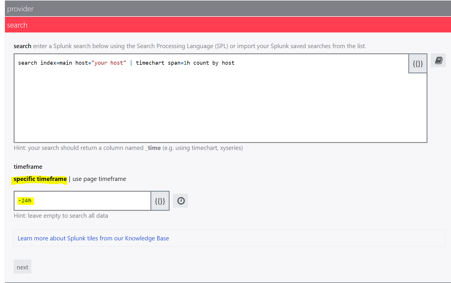
Are you using specific timeframe? From the screenshot, it looks like the specific timeframe is set to @month.
Try using the specific timeframe with -24h.
Thanks!
@ASP actually I am specifying -24h in my timeframe. Interestingly enough, I don’t have this issue with my windows index. Sorry for the late reply
@ASP Thank you for your help. Initially I was using the following search for my linux index which was giving me that ugly graph.
| tstats count WHERE index=linux by _time, host
| timechart span=1h dc(host)
| sort _time
I changed it to your suggestion:
index=linux host=*
|timechart span=1h dc(host)
|sort _time
which gave me the chart below. More or less what I was looking for.
