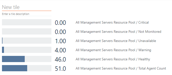
Is there not a way to roll up health states of all objects in a particular class into say a pie chart? For instance I have 2200 VMS and want a visual of how many are critical/warning/healthy at a glance. I’ve attached a sample screen shot. This would be a great feature being that every monitoring product that I am trying to replace with SCOM/SquaredUp has this type of visual.
I've just gone down this path. Similar to what jannep posted above.
What I’m doing to create pie charts is to use SSRS 2016 and SQL Mobile Report Publisher. From there I can publish the dashboards and embed them into a tile in SquaredUp.
Probably closest thing to having different types of Charts.